Introduction
Legal blindness, vision impairment, and color vision impairment are very common issues:
- "...findings from the 2015 National Health Interview Survey (NHIS) data release established that an estimated 23.7 million adult Americans (or 10% of all adult Americans) reported they either "have trouble" seeing, even when wearing glasses or contact lenses, or that they are blind or unable to see at all.”
- Color vision impairments affect ~5% of individuals. Rates vary based on population groups and ethnicity, but in the United States, red-green color vision defects are the most common, followed by blue-yellow defects and blue cone monochromacy.
There are several common-sense steps you can take to make your visualizations more accessible to a wider audience, including folks with a variety of visual impairments.
WCAG Guidlines
The Web Concent Accessibility Guidelines (WCAG) were created by the World Wide Web Consortium (W3C) to develop standards & ratings to ensure inclusive design on the web.
These guidelines mandate that materials are:
- Perceivable
- Operable
- Understandable
- Robust
Here, we will focus on changes you can make to make your visualizations more perceivable and understandable to diverse users.
Perceivable: Distinguishable
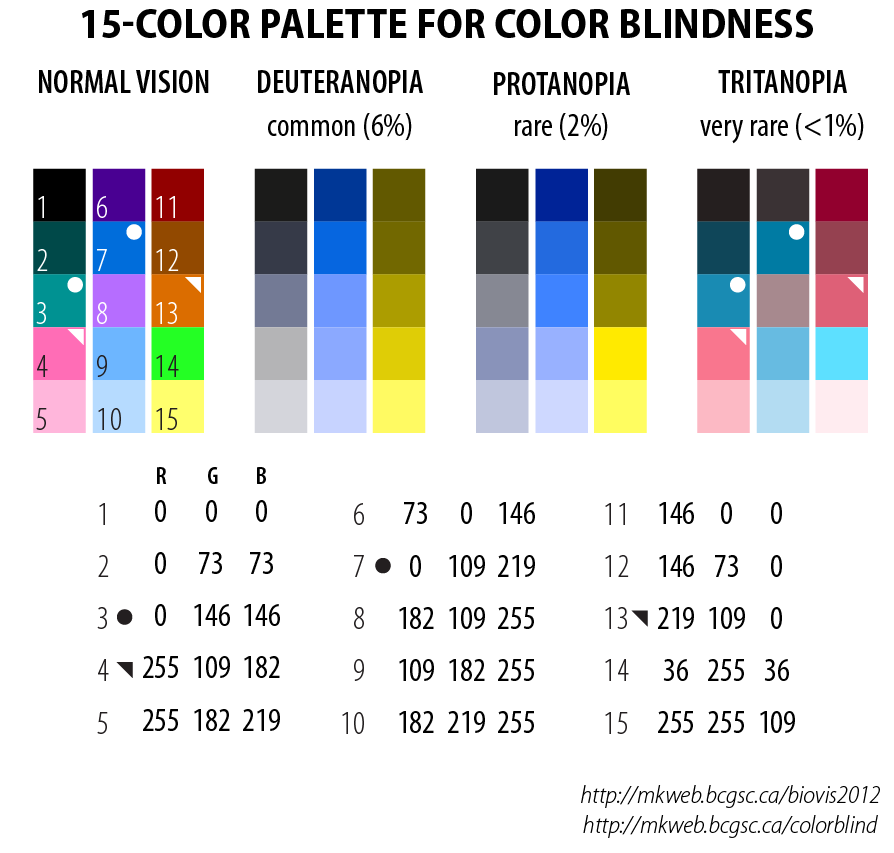
Color blind palettes or the ability to create a custom palette is available for most visualization tools.
Choosing color blind palettes in Excel
Choosing color blind palettes in Tableau
Perceivable: Alternative Text
Adding alt text to charts provides the flexibility for users to change the content into other forms, like large print or speech.
Understandable: Legible and Clear
Create separate, distinctive visualizations are easier for everyone to read and doesn’t distort content for viewers who are using a screen reader.
Ensure your content appears in a logical order, that filters and navigation tools are consistent, and that views only changes when the user initiates it.
Notes
Based on a webinar given by Kelsey McCormick and myself in Winter 2018: "Visually Accessible Design & Data Visualization 101"
https://nfb.org/fact-sheet-blindness-and-low-vision
https://en.wikipedia.org/wiki/Visual_impairment